
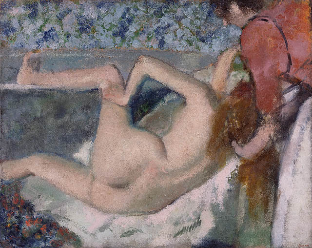

A curator went looking for a blue that Edgar Degas used more than a century ago and found that the color did not quite exist anymore. The search led from the Getty’s pastel collection to La Maison du Pastel, the historic French maker whose lineage reaches back to the eighteenth century. It ended not with a perfect match from an old box, but with a new color for artists today.
The starting point was Degas’s circa-1895 pastel Après le bain (Femme s’essuyant). Getty curator Danielle Canter wanted to understand the muted blue that helps structure the work. Digital images and printed charts could only go so far; pastel is experienced through pigment, texture, pressure and the light on its surface.
A color has a material history
Pastel can appear immediate because the pigment sits close to the surface with relatively little binder. That directness is also what makes historical color difficult to reproduce. Pigments change, ingredients become unavailable, manufacturing methods evolve and the surrounding paper ages.
La Maison du Pastel has preserved formulas and hand-making knowledge across generations. Its present custodians, Isabelle Roché and Margaret Zayer, maintain a range of roughly two thousand colors while continuing to test new variations. Degas himself used the company’s materials, making the atelier more than a modern supplier in this search; it is part of the artwork’s technical history.
The detective work of looking
Matching the blue required comparison rather than certainty. A swatch that looked right in isolation could behave differently beside the pastel’s warmer tones. The target was neither a bright sky blue nor a neutral gray, but a restrained color whose character emerged through relationship.
The search reveals how connoisseurship and conservation depend on making. To identify what the eye sees, researchers often need to understand how a material was held, layered and combined. A color chart is evidence, but so are the marks left by an artist’s pressure and the optical effects produced by neighboring pigments.
When the existing range failed to provide a satisfying equivalent, the atelier created a new pastel. The color has been tentatively called “Seafoam.” Its name belongs to the present, but its origin lies in a close encounter with a nineteenth-century artist’s choice.
Not a resurrection, but a continuation
The new stick does not claim to recover an original formula with absolute certainty. That would ignore the changes in the artwork and in the materials themselves. Instead, it records a contemporary answer to a historical observation.
This distinction is what makes the story extraordinary. The goal was not to freeze the past. It was to let research, craft and artistic use continue the conversation. A museum’s question became a maker’s experiment, and the experiment produced a color that other artists can now place into new work.
For artists, the episode is a reminder that materials carry lineages. Choosing a pastel is never only choosing a hue; it is choosing a density, a recipe, a resistance, a way light settles on the surface. For museums, it demonstrates that technical study can generate knowledge beyond the conservation lab.
Degas’s blue remains part of one particular image, inseparable from its paper, age and touch. “Seafoam” does something different. It translates attentive looking into a usable future—a small object made by hand because one color in an old pastel refused to be taken for granted.